No.5 / The Nightshade — UI/UX Redesign
A React-based redesign that transformed a static, text-heavy roster site into a dynamic, API-driven interface with real-time filtering and improved usability.
Overview
The original website relied heavily on plain text for both rosters and profile pages.
If you wanted to see who was working, you had to click through multiple profiles one by one. It technically worked, but the experience was slow and frustrating.
I rebuilt the interface using React, integrating with an existing backend API to dynamically render roster and profile data.
The goal was simple: reduce clicks, improve scanability, and make the whole thing feel less like digging through text.
Problem
Before
The original site was functional in the most tragic sense of the word.
- Rosters were plain text links, requiring users to open multiple profiles just to see availability
- Profile pages had weak hierarchy, with dense text and low readability
- Key attributes (services, nationality, availability) were hard to scan quickly
- Staff relied on text-heavy input, leading to inconsistent data
Approach
I focused on reducing unnecessary interaction and making information easier to scan.
Instead of forcing users through a click-by-click flow, I shifted the roster into an image-first, data-driven interface. The idea was that users should be able to understand availability at a glance.
On the frontend, I used React to manage UI state and dynamically render data from the API. This allowed filtering and updates to happen instantly without page reloads.
For profile pages, I reorganised the layout into structured sections so users could quickly find what they care about instead of reading through blocks of text.
What I changed

After
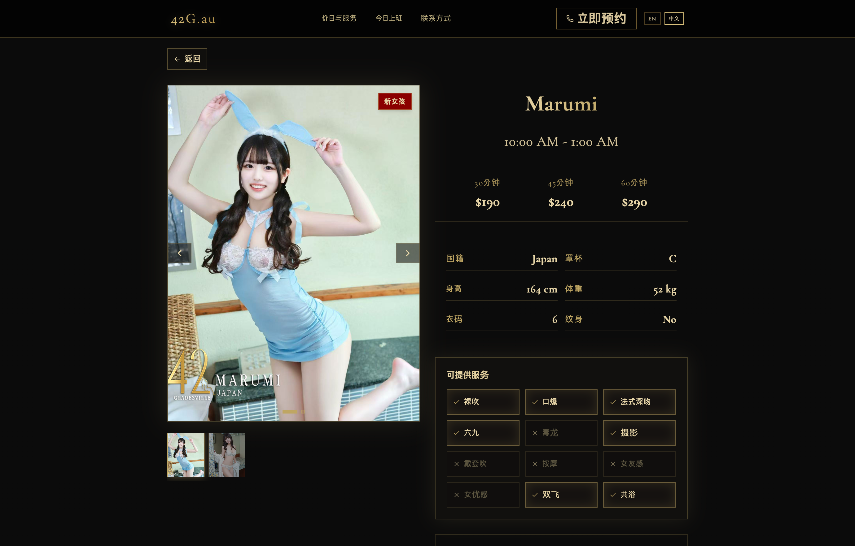
Image-first roster
Replaced plain text listings with a card-based layout rendered from API data, allowing users to instantly see who is working.
Filter functionality
Implemented client-side filtering for:
- nationality
- services
- working time
Managed state in React so results update immediately without additional page loads.
Profile page redesign
- service sections
- provider info panels
- visual tags such as New and Real Photo
This improved both readability and consistency.
Translation feature
Added a translation layer to support multi-language content, making the platform more accessible to a broader audience.
CTA improvements
Introduced dedicated CTA components (Call now / Book now) to guide users from browsing to action.
Data & API integration
Integrated with an existing backend API to fetch and render roster and profile data dynamically.
Mapped raw API responses into UI-friendly formats for consistent rendering across components.
Component structure
Built reusable React components for roster cards, filters, and profile sections, improving maintainability and making future changes easier.
Outcome
The site shifted from a text-heavy directory into a more usable, scan-friendly interface.
- Users can quickly see who is available without opening multiple pages
- Filtering makes it easier to narrow down options
- Profile information is clearer and easier to compare
- Staff benefit from more structured data handling
- CTA placement makes the transition from browsing to enquiry more direct
No analytics were available, but qualitatively the experience became significantly faster and easier to use.
Note
Worked on two shops simultaneously with shared functionality but different visual themes, which added complexity to both design and implementation.
Tech
Frontend: React, TypeScript
Backend: Existing backend (API integration)
Work included: UI redesign, API integration, data mapping, client-side filtering logic, reusable component structure, translation support, CTA implementation
This project is currently live (NSFW). View it here.